My experience with WAVE Accessibility Checker
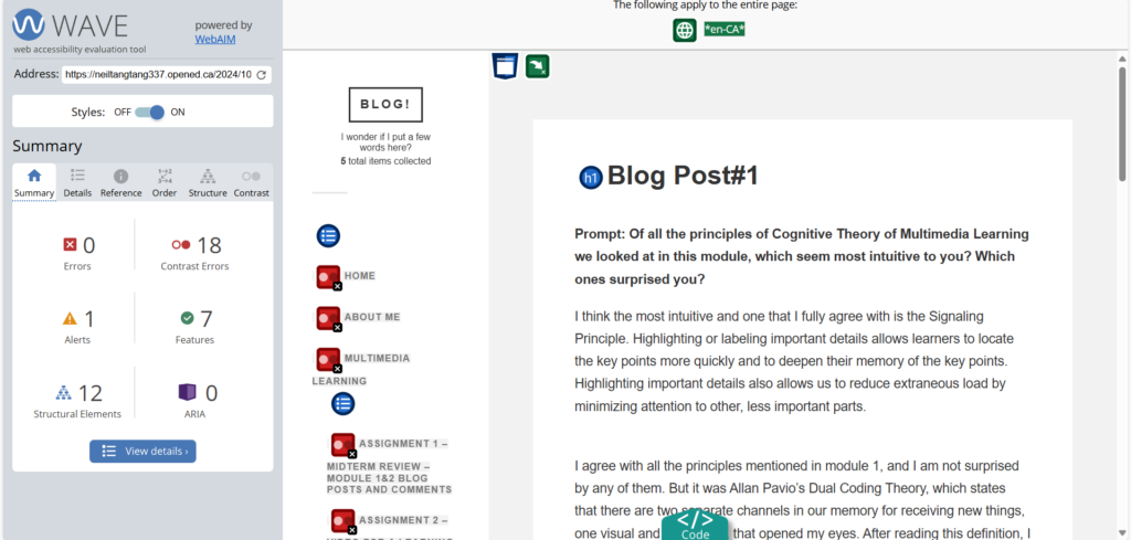
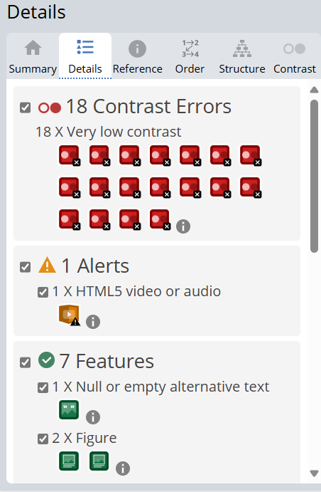
When I used WAVE to check my blog post#1, a lot of red errors popped up which startled me, but when I took a closer look, these ERRORs were the LOW CONTRAST of the color of the font of my blog site. When I took a look at it myself, I found that there was indeed a certain problem, but the reason for this low contrast was supposedly that it wasn’t selected yet, and when the mouse was moved to the corresponding position, the font will HIGHLIGHT, which is a way of presenting the site. However, WAVE is really easy to use and can provide me with good help, I will use this tool more in the future to check the accessibility of my published content on the site. Of course, I don’t only use this tool for checking, but also in combination with other tools to improve the accessibility of the content I publish.


My experience with Text to Speech/Screen Readers
I used a screen reader to try to read this tweet, screen reading example posted on Twitter by Kent Dodds. I’m using the screen reader that comes with the Microsoft Edge browser, which skips over non-font characters when they are encountered. If I were visually impaired or otherwise in need of a screen reader, I’d be completely at a loss to understand the point of this tweet.
After that,I copied the content of this tweet into this tool, NaturalReader, and I encountered the same situation of skipping non-font characters.
When I use these tools to listen to the content of this blog, I can get the content of this blog without any visualization at all (of course, you still need to click on the teaching resources inside), smooth and clear. As a non-native English speaker, I am more impressed with the content of the postings as I read them in the reader. I really like this tool. Of course, non-font characters should be avoided wherever possible, and can sometimes cause real trouble for those who need a screen reader.
Create my infographic
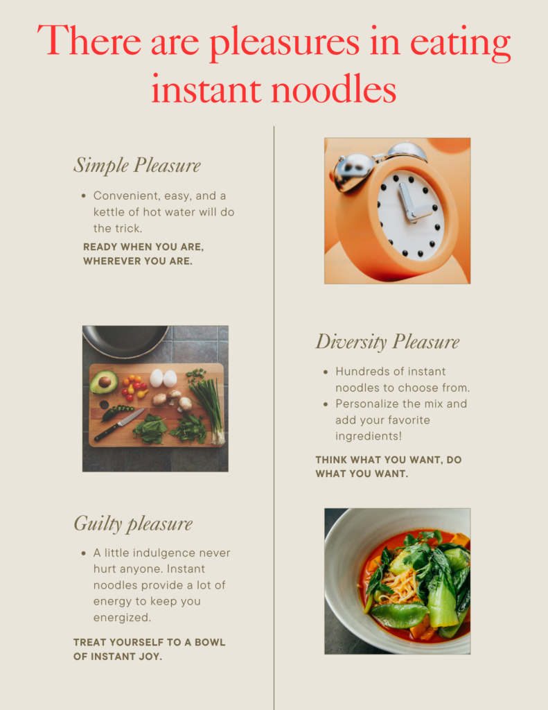
I tried to use a hierarchy and keep both fonts, I designed it more like a menu style create a hierarchy of information but fitting the feel of the food. It was my first time using Canva to make an infograph, and in fact I’ve basically never made an infograph before.I chose something that interests me to tell a simple story about how eating instant noodles can make you feel pleasure, and I explained a few points to the viewer of the infograph. I think it looks pretty good.

Reflections
Have you used Text to Speech tools before? Did you find it useful? Did you try out some of the different voices? What impact did the different voices have on your ability to absorb information?
I have used a text-to-speech tool, the screen reader that comes with Microsoft Edge. In addition, I have used text-to-speech to listen to novels. I find it very useful, as often you can listen to something and do other things at the same time without being distracted from processing the information visually. I’ve tried different voices, some of which have accents and are a bit slurred for me, which reduces my information processing efficiency, but when I choose a familiar, smooth voice, it makes it easier and more enjoyable to receive the information. In addition, I have also used voice-to-text tools, such as in the social software wechat, I can use this function to quickly and easily without listening to what the other party said will be more than ten seconds or even few minutes of voice content. It greatly facilitates communication.
Comment
The Effective Way to Design Presentation – 337studentsite
